Shepherd Wealth & Retirement
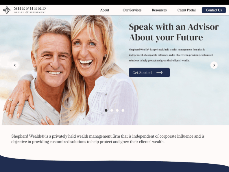
Shepherd Wealth & Retirement is a wealth management firm dedicated to helping business owners build, protect, and grow their financial legacy.


Shepherd Wealth & Retirement sought to improve their website in order to increase their online visibility to potential local and national clients and broaden the scope of services they offered.
OUR PROMPT
Redesign the Shepherd Wealth & Retirement website to establish trust and credibility by providing clear, detailed information about services. The goal is to create a user-friendly experience that encourages prospective clients to feel confident and motivated to reach out for financial guidance.
TIMELINE
Aug 2022–May 2023
ROLE
Project Manager
UX Designer
DISCIPLINE
Design
Research
TEAM
4 people
TOOLS
Figma
Otter
Maze
UserTesting
About Our Client
Shepherd Wealth & Retirement is a Tucson-based wealth management firm led by a father and son team. Specializing in high-level, personalized financial planning, they guide affluent families and business owners in preserving and growing their wealth. Their client base primarily consists of individuals over 50, reflecting a focus on long-term financial security and legacy building.

Understanding the Problem
A 2021 J.D. Power study found that only 43% of participants easily accessed retirement plan info online, raising transparency concerns. J. D. POWER
Prospective Shepherd Wealth (SW) clients are looking for a website that establishes trust and credibility while providing clear, detailed information about available services. They want to understand the firm’s expertise, service offerings, and business processes before feeling comfortable enough to engage with an advisor. The current website lacks the transparency and depth needed to address these concerns, creating hesitation among potential clients and limiting engagement opportunities.
Business Challenge
Prospective clients seek a website that reflects credibility and transparency in business operations, offering clear and detailed information about available services before they feel comfortable reaching out to an advisor.
Shepherd Wealth & Retirement sought to improve their website in order to increase their online visibility to potential local and national clients and broaden the scope of services they offered.
OUR PROMPT
Redesign the Shepherd Wealth & Retirement website to establish trust and credibility by providing clear, detailed information about services. The goal is to create a user-friendly experience that encourages prospective clients to feel confident and motivated to reach out for financial guidance.
TIMELINE
Aug 2022–May 2023
ROLE
Project Manager
UX Designer
DISCIPLINE
Design
Research
TEAM
4 people
TOOLS
Figma
Otter
Maze
UserTesting
About Our Client
Shepherd Wealth & Retirement is a Tucson-based wealth management firm led by a father and son team. Specializing in high-level, personalized financial planning, they guide affluent families and business owners in preserving and growing their wealth. Their client base primarily consists of individuals over 50, reflecting a focus on long-term financial security and legacy building.
Understanding the Problem
A 2021 J.D. Power study found that only 43% of participants easily accessed retirement plan info online, raising transparency concerns. J. D. POWER
Prospective Shepherd Wealth (SW) clients are looking for a website that establishes trust and credibility while providing clear, detailed information about available services. They want to understand the firm’s expertise, service offerings, and business processes before feeling comfortable enough to engage with an advisor. The current website lacks the transparency and depth needed to address these concerns, creating hesitation among potential clients and limiting engagement opportunities.
Business Challenge
Prospective clients seek a website that reflects credibility and transparency in business operations, offering clear and detailed information about available services before they feel comfortable reaching out to an advisor.
Shepherd Wealth & Retirement sought to improve their website in order to increase their online visibility to potential local and national clients and broaden the scope of services they offered.
OUR PROMPT
Redesign the Shepherd Wealth & Retirement website to establish trust and credibility by providing clear, detailed information about services. The goal is to create a user-friendly experience that encourages prospective clients to feel confident and motivated to reach out for financial guidance.
TIMELINE
Aug 2022–May 2023
ROLE
Project Manager
UX Designer
DISCIPLINE
Design
Research
TEAM
4 persons
TOOLS
Figma
Otter
Maze
UserTesting
INTRODUCTION
Client Overview
About Our Client
Shepherd Wealth & Retirement is a Tucson-based wealth management firm led by a father and son team. Specializing in high-level, personalized financial planning, they guide affluent families and business owners in preserving and growing their wealth. Their client base primarily consists of individuals over 50, reflecting a focus on long-term financial security and legacy building.
Understanding the Problem
A 2021 J.D. Power study found that only 43% of participants easily accessed retirement plan info online, raising transparency concerns. J. D. POWER
Prospective Shepherd Wealth (SW) clients are looking for a website that establishes trust and credibility while providing clear, detailed information about available services. They want to understand the firm’s expertise, service offerings, and business processes before feeling comfortable enough to engage with an advisor. The current website lacks the transparency and depth needed to address these concerns, creating hesitation among potential clients and limiting engagement opportunities.
Business Challenge
Prospective clients seek a website that reflects credibility and transparency in business operations, offering clear and detailed information about available services before they feel comfortable reaching out to an advisor.
Redesigning the website to highlight credibility and transparency will build trust with potential clients, making them more likely to engage and inquire about financial services.
RESEARCH
Market Analysis
User Interviews
To get a better understanding of the market for financial advisors, my colleagues and I analyzed financial management companies in Tucson, Arizona and around the country. We determined that Shepherd Wealth's website lacked important components that prospective clients may find valuable yet are available on their competitors' websites.
Features
Shepherd Wealth and Retirement
TCI Wealth Advisors
Underhill Financial Advisors
Ritholtz
Florida Financial Advisors
Offers retirement planning?
Is there a client portal?
Does the site provide an educational section (ex. book, videos)?
Is there a section with the description of services?
Does the site have newsletters?
Is there an accreditation section?
Does the site provide a qualifying assessment?
Is there an about/ company values section?
I conducted user interviews during the project’s development phase to gain valuable insights into the needs and behaviors of our target audience—affluent individuals who rely on financial advisors. Over the course of a week, I recruited and interviewed 30 people , focusing on understanding their challenges, expectations, and preferences.
Q
What qualifications do you look for in a financial advisor?
If you have visited the websites of financial advisors, what impressions do you have of them?
Before deciding to become a client, what aspects of a website would be most useful?
What's your communication style with your financial advisor?
Can you describe your interactions with past and present advisors?
RESEARCH
Market Analysis
To get a better understanding of the market for financial advisors, my colleagues and I analyzed financial management companies in Tucson, Arizona and around the country. We determined that Shepherd Wealth's website lacked important components that prospective clients may find valuable yet are available on their competitors' websites.
Features
Shepherd Wealth and Retirement
TCI Wealth Advisors
Underhill Financial Advisors
Ritholtz
Florida Financial Advisors
Offers retirement planning?
Is there a client portal?
Does the site provide an educational section (ex. book, videos)?
Is there a section with the description of services?
Does the site have newsletters?
Is there an accreditation section?
Does the site provide a qualifying assessment?
Is there an about/ company values section?
User Interviews
I conducted user interviews during the project’s development phase to gain valuable insights into the needs and behaviors of our target audience—affluent individuals who rely on financial advisors. Over the course of a week, I recruited and interviewed 30 people , focusing on understanding their challenges, expectations, and preferences.
Q
What qualifications do you look for in a financial advisor?
If you have visited the websites of financial advisors, what impressions do you have of them?
Before deciding to become a client, what aspects of a website would be most useful?
What's your communication style with your financial advisor?
Can you describe your interactions with past and present advisors?
Organizing Insights to Identify Patterns
The feedback collected helped refine the design strategy and ensured our solutions aligned with user expectations. Key questions focused on user experiences with financial advisors and decision-making processes.
Wireframes
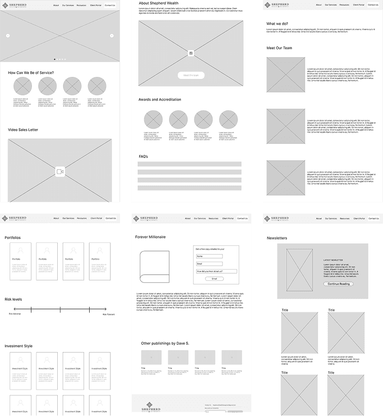
I started the creative process with low-fidelity sketches and wireframes. My drawings were influenced by the original user interviews, business objectives, and competitive analysis. It was a difficult time for my team and me when our team's lead designer left at the start of the design process.


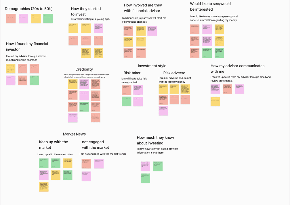
User Interviews
To better understand our users' goals, needs, and behaviors, I analyzed the data and created a persona representing the key traits of a typical Shepherd Wealth client.

DESIGN
Business Considerations
Shepherd Wealth & Retirement offers valuable services that weren’t reflected on their current site, which would improve their credibility.
I evaluated the current user flow to identify gaps in showcasing existing services and explored ways to improve the experience for potential clients.
SW PREVIOUS USER FLOW

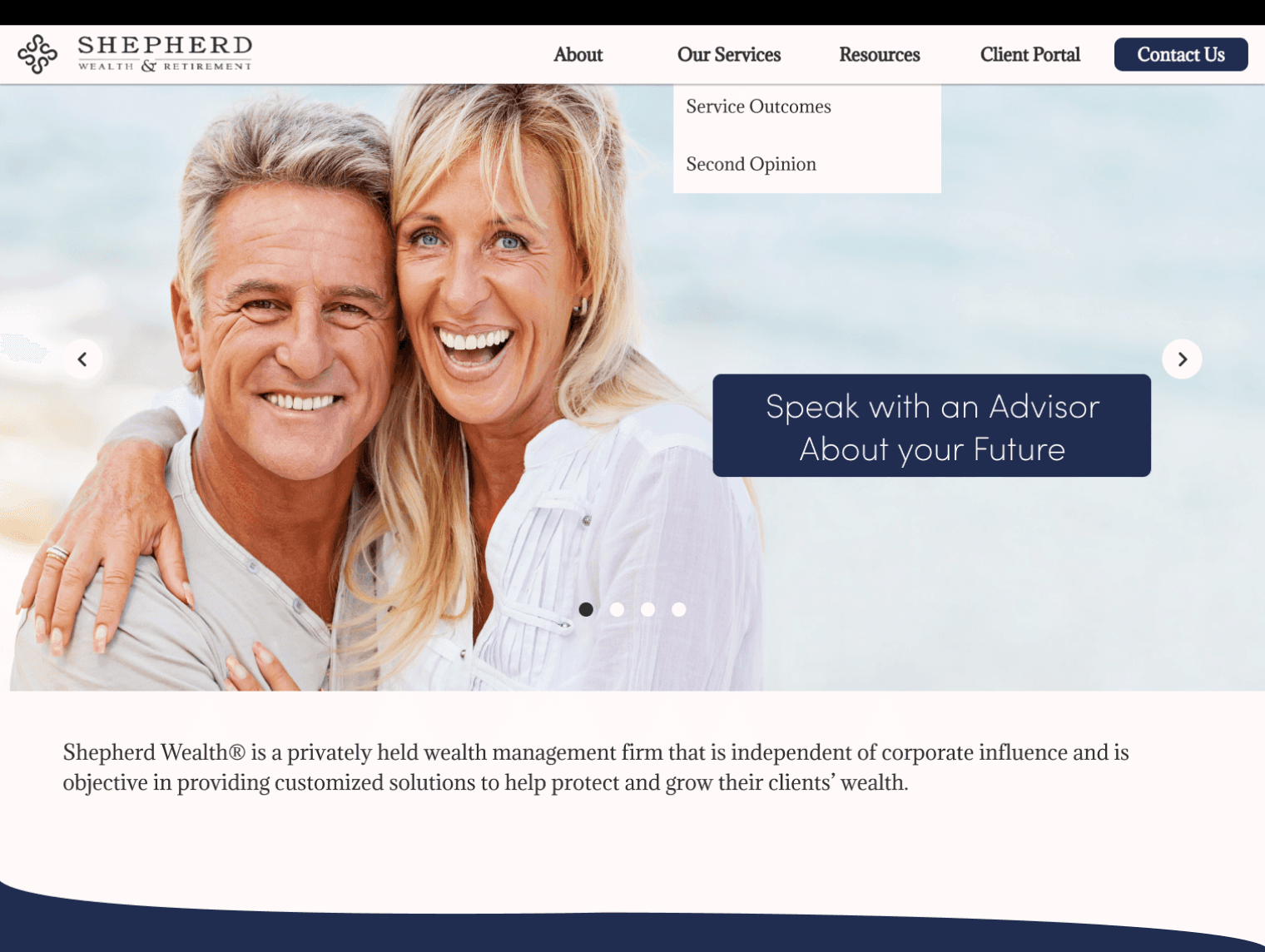
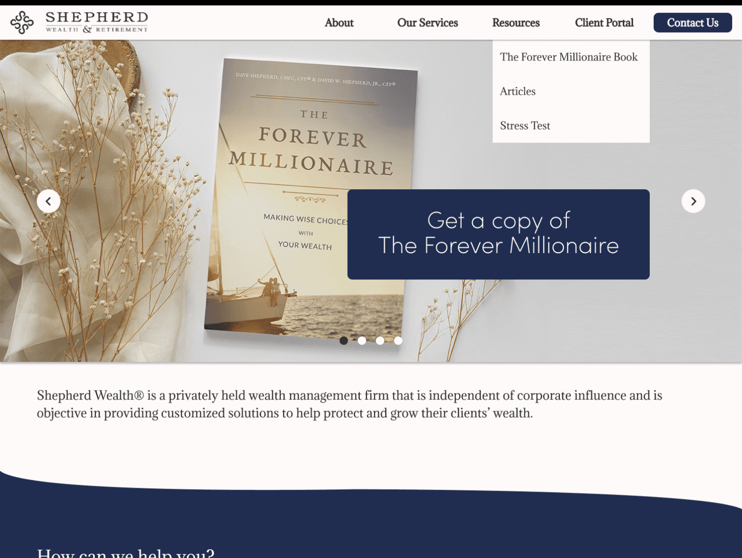
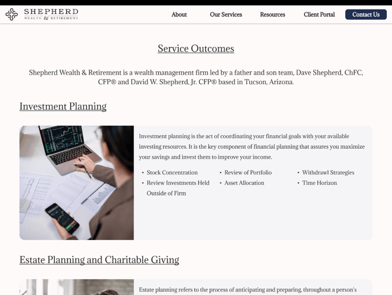
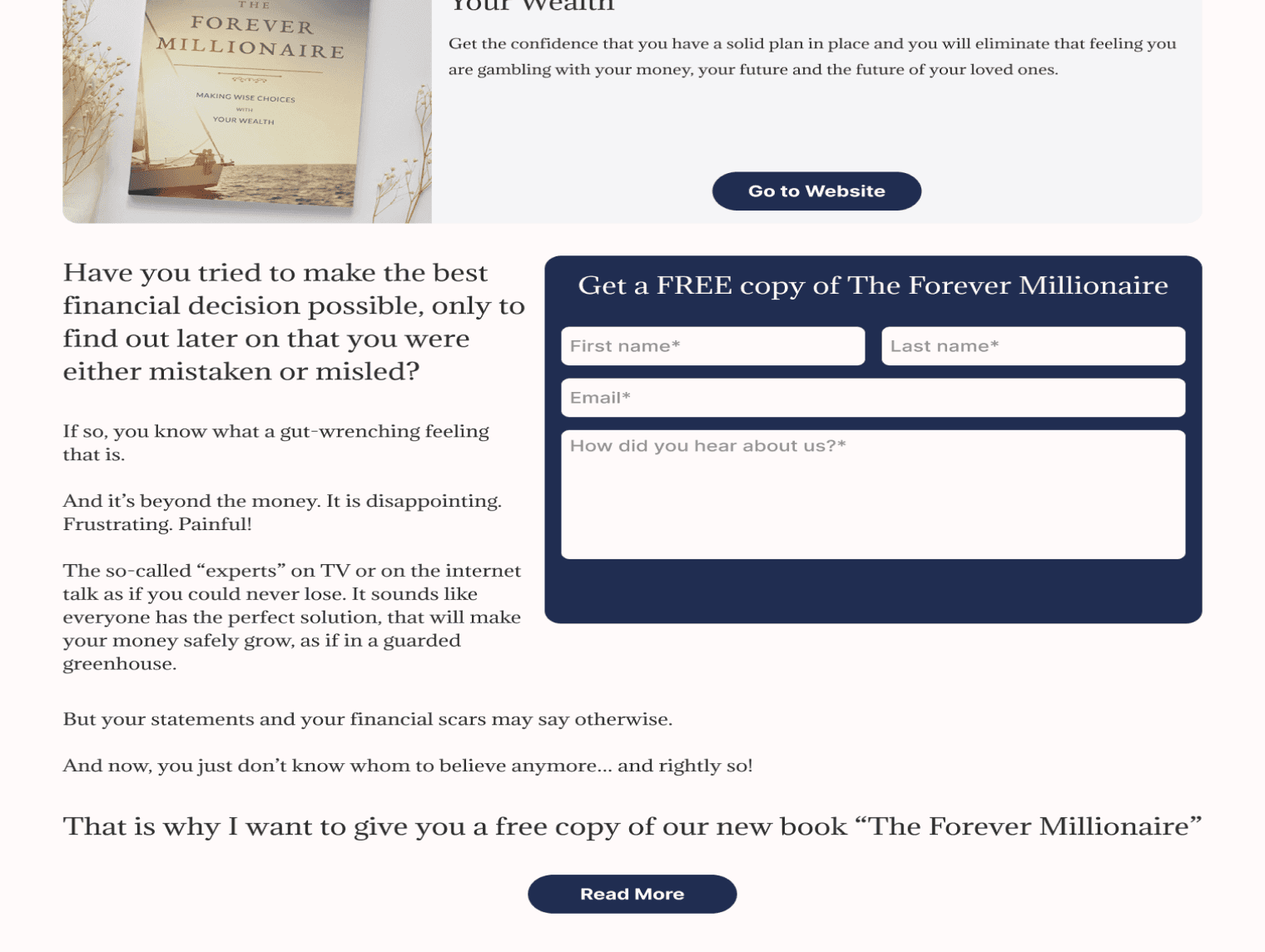
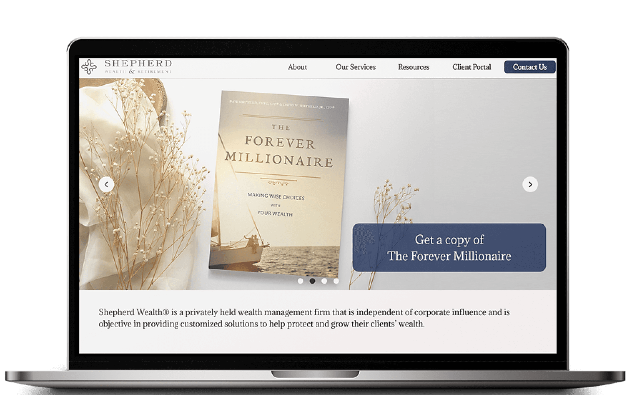
The new user flow includes: a more direct way to schedule a consultation call, list of services displayed in the navigation bar, link to their book, an about page dedicated to the SW team, and frequently asked questions.
SW UPDATED USER FLOW

Organization of the Navigation Bar
After sketching the design, I was unsure how to organize the navigation bar, particularly whether the "About" or "Services" tab should come first. To resolve this, I surveyed 15 people to determine the most intuitive navigation setup for a financial firm's website.
Global Navigation Survey
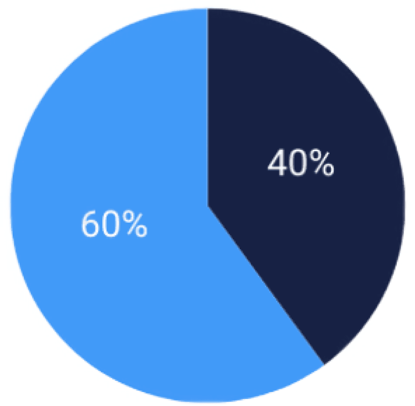
60% of people voted for the about tab to be the first option in the navigation menu while 40% agreed that services tag should be the first option in the menu.
To test the trustworthiness of language, we surveyed ten participants. Each question presented two options: a client-focused answer like "what we can do for you" and a company-focused one like "what our firm does for clients." We then asked which response felt more trustworthy.
Credibility Survey

For prospective clients, 60% of participants chose the company focused language on the homepage.
70% of people preferred company bios that were straight forward and professional.
80% of people chose client focused language regarding services.
Mid fi Designs
Building on the improved user flow, the mid-fidelity designs focus on streamlining navigation and enhancing the overall user experience. Key updates include clearer service listings, easier scheduling, and improved content organization to build trust and engagement.
Organizing Insights to Identify Patterns
The feedback collected helped refine the design strategy and ensured our solutions aligned with user expectations. Key questions focused on user experiences with financial advisors and decision-making processes.
User Interviews
To better understand our users' goals, needs, and behaviors, I analyzed the data and created a persona representing the key traits of a typical Shepherd Wealth client.
Business Considerations
Shepherd Wealth & Retirement offers valuable services that weren’t reflected on their current site, which would improve their credibility.
I evaluated the current user flow to identify gaps in showcasing existing services and explored ways to improve the experience for potential clients.
SW PREVIOUS USER FLOW
The new user flow includes: a more direct way to schedule a consultation call, list of services displayed in the navigation bar, link to their book, an about page dedicated to the SW team, and frequently asked questions.
SW UPDATED USER FLOW
User Interviews
To better understand our users' goals, needs, and behaviors, I analyzed the data and created a persona representing the key traits of a typical Shepherd Wealth client.
DESIGN
Business Considerations
Shepherd Wealth & Retirement offers valuable services that weren’t reflected on their current site, which would improve their credibility.
I evaluated the current user flow to identify gaps in showcasing existing services and explored ways to improve the experience for potential clients.
SW PREVIOUS USER FLOW
The new user flow includes: a more direct way to schedule a consultation call, list of services displayed in the navigation bar, link to their book, an about page dedicated to the SW team, and frequently asked questions.
SW UPDATED USER FLOW
Wireframes
I started the creative process with low-fidelity sketches and wireframes. My drawings were influenced by the original user interviews, business objectives, and competitive analysis. It was a difficult time for my team and me when our team's lead designer left at the start of the design process.
User Interviews
After sketching the design, I was unsure how to organize the navigation bar, particularly whether the "About" or "Services" tab should come first. To resolve this, I surveyed 15 people to determine the most intuitive navigation setup for a financial firm's website.
Global Navigation Survey
60% of people voted for the about tab to be the first option in the navigation menu while 40% agreed that services tag should be the first option in the menu.
To test the trustworthiness of language, we surveyed ten participants. Each question presented two options: a client-focused answer like "what we can do for you" and a company-focused one like "what our firm does for clients." We then asked which response felt more trustworthy.
Credibility Survey

For prospective clients, 60% of participants chose the company focused language on the homepage.
70% of people preferred company bios that were straight forward and professional.
80% of people chose client focused language regarding services.
Mid fi Designs
Building on the improved user flow, the mid-fidelity designs focus on streamlining navigation and enhancing the overall user experience. Key updates include clearer service listings, easier scheduling, and improved content organization to build trust and engagement.

Wireframes
I started the creative process with low-fidelity sketches and wireframes. My drawings were influenced by the original user interviews, business objectives, and competitive analysis. It was a difficult time for my team and me when our team's lead designer left at the start of the design process.
User Interviews
After sketching the design, I was unsure how to organize the navigation bar, particularly whether the "About" or "Services" tab should come first. To resolve this, I surveyed 15 people to determine the most intuitive navigation setup for a financial firm's website.
Global Navigation Survey
60% of people voted for the about tab to be the first option in the navigation menu while 40% agreed that services tag should be the first option in the menu.
To test the trustworthiness of language, we surveyed ten participants. Each question presented two options: a client-focused answer like "what we can do for you" and a company-focused one like "what our firm does for clients." We then asked which response felt more trustworthy.
Credibility Survey
For prospective clients, 60% of participants chose the company focused language on the homepage.
70% of people preferred company bios that were straight forward and professional.
80% of people chose client focused language regarding services.
Mid fi Designs
Building on the improved user flow, the mid-fidelity designs focus on streamlining navigation and enhancing the overall user experience. Key updates include clearer service listings, easier scheduling, and improved content organization to build trust and engagement.
Validating the Design
I conducted the first round of user testing with finance enthusiasts to assess the usability and clarity of my mid-fidelity design. Their feedback guided improvements before moving to high-fidelity prototyping.
Testing
First Iteration

A
B
A
B

C
C
D
D

E
E

F
F
Idea
A. Services drop-down tab in the navigation bar
B. Carousel displaying available features
C. Resources drop-tab in the navigation bar
D. List of portfolio types
E. Description of cards for portfolio types
F. Contact questionnaire for potential clients
Feedback
A. Portfolio under ‘Our services’ tab was not intuitive
B. Pace of the carousel was too quick for the user to read and click on
C. Blog under the ‘Resources’ tab was not intuitive
D. Users were confused by the portfolio cards being different investing approaches
E. Clicking on the card to read the portfolio description was not intuitive
F. The questionnaire was time consuming
Testing
First Iteration
A
B
C
D
E
F
Idea
A. Services drop-down tab in the navigation bar
B. Carousel displaying available features
C. Resources drop-tab in the navigation bar
D. List of portfolio types
E. Description of cards for portfolio types
F. Contact questionnaire for potential clients
Feedback
A. Portfolio under ‘Our services’ tab was not intuitive
B. Pace of the carousel was too quick for the user to read and click on
C. Blog under the ‘Resources’ tab was not intuitive
D. Users were confused by the portfolio cards being different investing approaches
E. Clicking on the card to read the portfolio description was not intuitive
F. The questionnaire was time consuming
Refining the Design
After implementing feedback from the first round, I conducted a second round of testing to evaluate improvements and ensure a smoother user experience. This phase focused on refining interactions and addressing any remaining pain points.
Testing
Second Iteration
A
A
B
B

C
C
D
D
Iterations
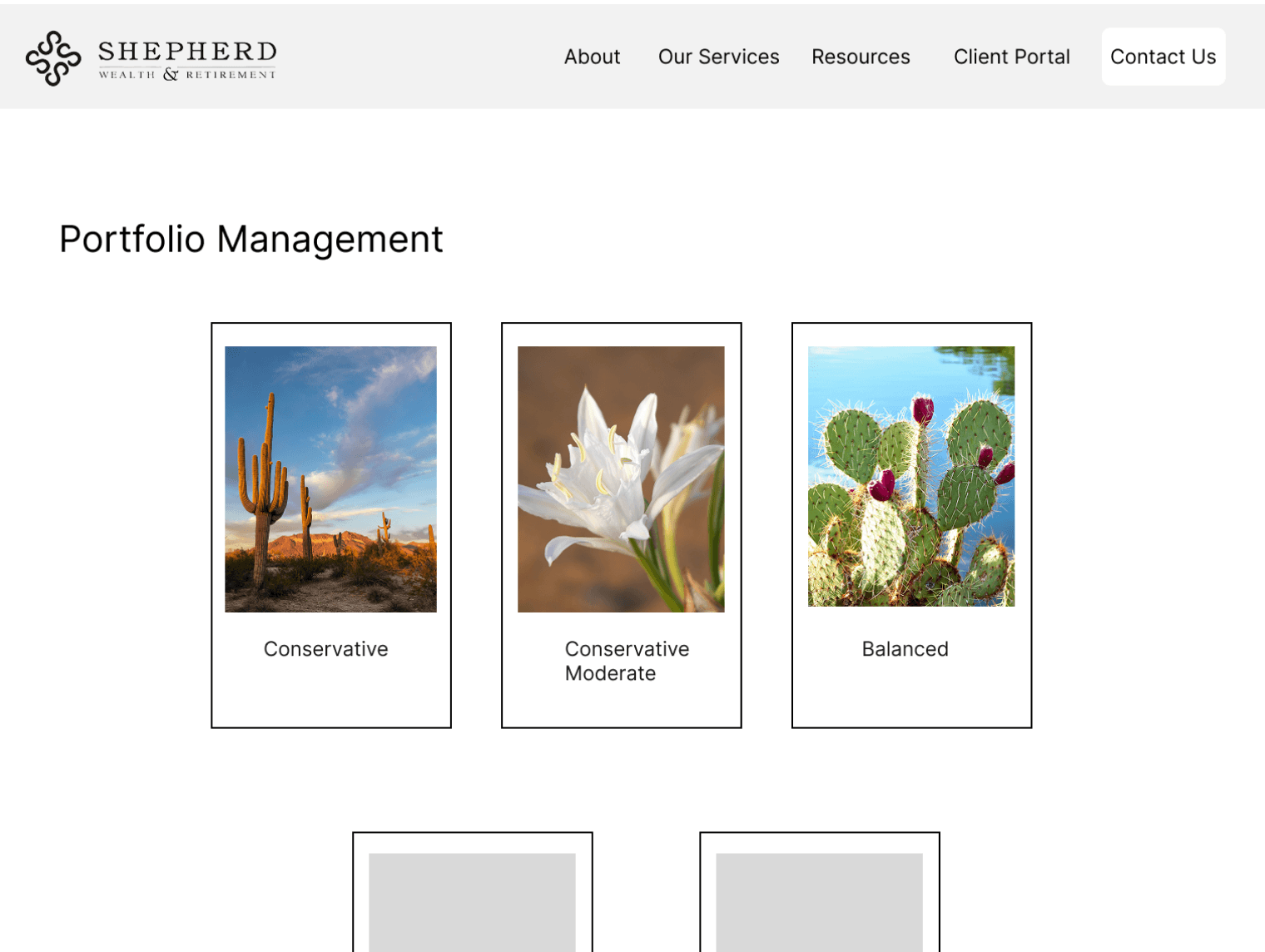
A. Updated “Portfolios” to “Service Outcomes
B. Replaced “Blog” with “Articles” under Resources
C. Created a contact form to replace the questionnaire
D. Replaced portfolio cards with clear service descriptions
Refining the Design
After implementing feedback from the first round, I conducted a second round of testing to evaluate improvements and ensure a smoother user experience. This phase focused on refining interactions and addressing any remaining pain points.
Testing
First Iteration
A
B
A
B
C
C
D
D
E
E
F
F
Idea
A. Services drop-down tab in the navigation bar
B. Carousel displaying available features
C. Resources drop-tab in the navigation bar
D. List of portfolio types
E. Description of cards for portfolio types
F. Contact questionnaire for potential clients
Feedback
A. Portfolio under ‘Our services’ tab was not intuitive
B. Pace of the carousel was too quick for the user to read and click on
C. Blog under the ‘Resources’ tab was not intuitive
D. Users were confused by the portfolio cards being different investing approaches
E. Clicking on the card to read the portfolio description was not intuitive
F. The questionnaire was time consuming
Testing
First Iteration
A
A
B
B
C
C
D
D
Iterations
A. Updated “Portfolios” to “Service Outcomes
B. Replaced “Blog” with “Articles” under Resources
C. Created a contact form to replace the questionnaire
D. Replaced portfolio cards with clear service descriptions
Validating the Design
I conducted the first round of user testing with finance enthusiasts to assess the usability and clarity of my mid-fidelity design. Their feedback guided improvements before moving to high-fidelity prototyping.
Refining the Design
After implementing feedback from the first round, I conducted a second round of testing to evaluate improvements and ensure a smoother user experience. This phase focused on refining interactions and addressing any remaining pain points.
Analytics From User Testing
Completion Time
23 seconds
9.2%
Misclick Rate
80%
13%
Success Rate
(Direct/Indirect)
57% (D)/ 40% )
58% (D)/ 41% )
Bounce Rate
2%
0%
1st Round of Testing

2nd Round of Testing

Testing
Second Iteration
B
A
C
D
Iterations
A. Updated “Portfolios” to “Service Outcomes
B. Replaced “Blog” with “Articles” under Resources
C. Created a contact form to replace the questionnaire
D. Replaced portfolio cards with clear service descriptions
Analytics From User Testing
Completion Time
23 seconds
9 seconds
Misclick Rate
80%
13%
Success Rate
(Direct/Indirect)
57% (D)/ 40% )
58% (D)/ 41% )
Bounce Rate
2%
0%
1st Round of Testing
2nd Round of Testing

TAKEAWAYS
Future Steps
Reflections
Teamwork Makes the Dream Work.
After our lead designer left at the beginning of the design process, my team and I had to revise our plans to remain on schedule. My researchers offered to help design the prototype's user interface (UI) until we could find another designer to join the team. It's times like this that I appreciate working with such dedicated team members.
The Power of Networking.
Although we didn't have as many people as we wanted for the user interviews, we used outlets such as LinkedIn and acquaintances to assist in our quest for interviewees. Through these outlets, we were able to conduct user interviews with individuals who had financial advisors.
Growing as a Leader.
As the product designer, I learned a great deal about leadership, but the most essential lesson is to not be hesitant to ask for assistance.
Analytics From User Testing
1st Round of Testing
2nd Round of Testing
Completion Time
23 seconds
9 seconds
Misclick Rate
80%
13%
Success Rate
(Direct/Indirect)
57% (D)/ 40% )
58% (D)/ 41% )
Bounce Rate
2%
0%
TAKEAWAYS
Future Steps
Reflections
Teamwork Makes the Dream Work.
After our lead designer left at the beginning of the design process, my team and I had to revise our plans to remain on schedule. My researchers offered to help design the prototype's user interface (UI) until we could find another designer to join the team. It's times like this that I appreciate working with such dedicated team members.
The Power of Networking.
Although we didn't have as many people as we wanted for the user interviews, we used outlets such as LinkedIn and acquaintances to assist in our quest for interviewees. Through these outlets, we were able to conduct user interviews with individuals who had financial advisors.
Growing as a Leader.
As the product designer, I learned a great deal about leadership, but the most essential lesson is to not be hesitant to ask for assistance.
